Understanding the Workload Space
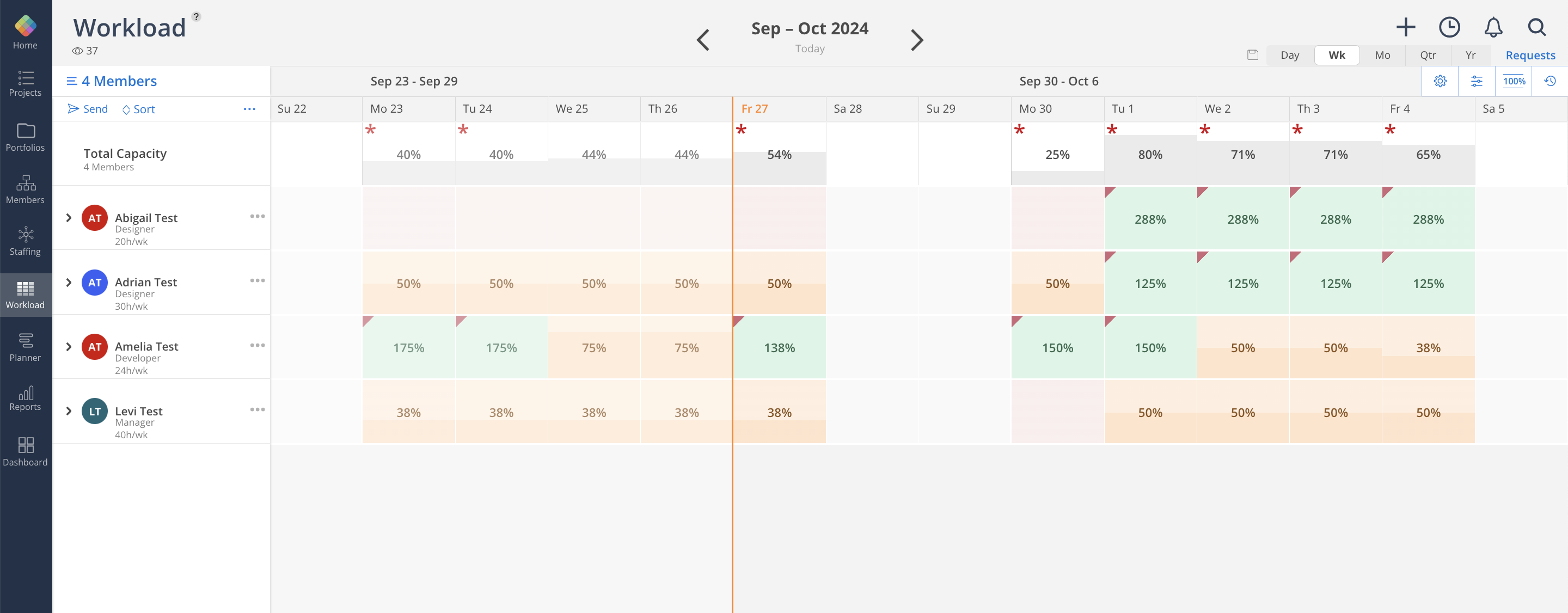
The workload space features a color heatmap, making it easy to view staff members' workloads at a glance.
Each row represents a team member, with colors serving as a heatmap for capacity. By default, red indicates low capacity, yellow represents over 50% capacity, and green signifies full capacity. The percentage values are rounded on the work plan bars, so the total percentage may vary by a few percentage points. When capacity exceeds 100%, a red triangle will appear in the left-hand corner of the cell. The color scheme and information display can be customized in the Settings.

Click the following link to read more:
Workload and Planner spaces both have the timeline feature which allows you to create and assign works to members, click here to learn more