
Overview
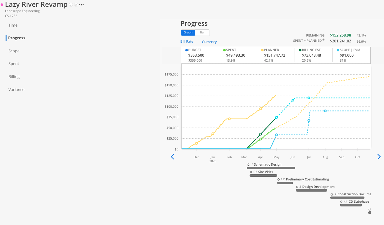
The Progress Tab gives you a graphical view of how the project is tracking financially. It plots spent time, planned time, billing estimates, scope, and budget as color-coded lines or bars across the project timeline. Use this Tab to quickly see whether the project is on track to stay within budget.
What You See
Line chart (default) — Each data series is a colored line showing cumulative values over time. Hover over any point to see the exact values for that date.
Bar chart — Shows spent vs planned side by side for each time period (e.g., month). Useful for comparing actual vs projected on a period-by-period basis.
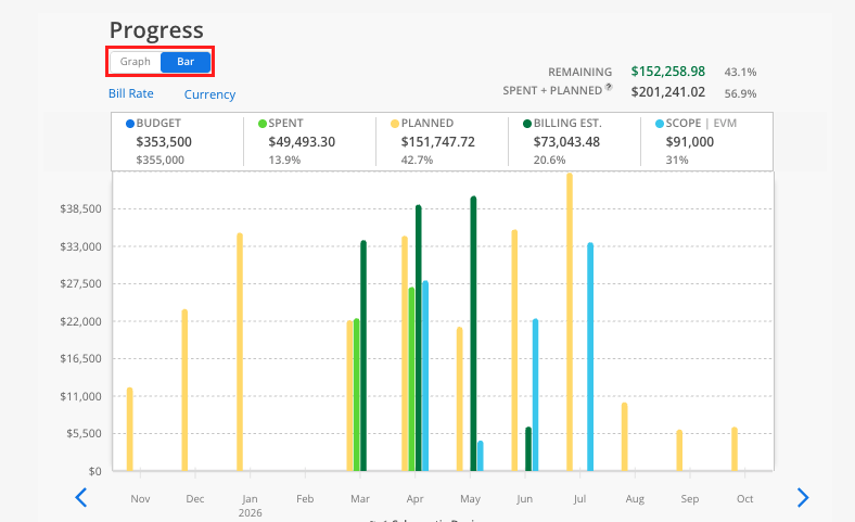
Color legend:
Lime green = Spent time
Yellow = Planned time
Green = Billing estimates (entered in Billing Tab)
Aqua blue = Scope estimates
Blue = Budget
How To Read the Progress Chart
Open the Budget and click the Progress tab.
The default view is a line chart showing the project over time.
Hover over any point on a line to see a tooltip with the date and exact amount.
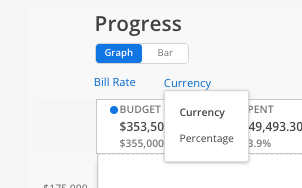
Toggle between currency and percentage using the button at the top.
Click the bar chart icon to switch to bar chart view.
In bar chart view, each time period shows what was spent and what was planned, making it easy to see months where spending exceeded or fell short of the plan.
Tips
Use the line chart for projections: It shows where you are heading based on current data.
Use the bar chart for retrospectives: It is better for comparing actual vs planned on a period-by-period basis.
Toggle to Cost Rate: For teams with cost rates enabled, toggle between bill and cost rates to see budget numbers reflect those rates