This is typically the first report teams use in Mosaic. It condenses the Workload space into a reporting view where you can quickly see who is over capacity, under capacity, or at a healthy utilization level. Access it from the Reports tab on the left sidebar.
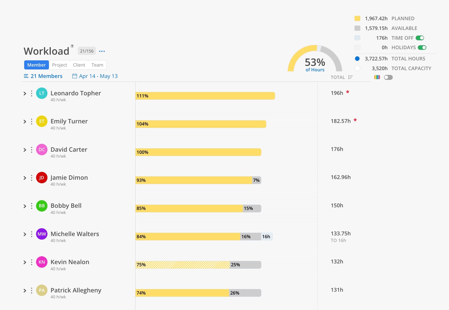
Use the Workload Report when you need to answer: "How much of my team's capacity is planned out, and who needs more or less work?" This is the go-to report for weekly staffing meetings, identifying who is overbooked, who has availability, and whether the team is on track for the upcoming 30 days. Start here before diving into any other report.
The Bars
Each member gets a horizontal bar showing how their capacity is being used:
Gray = available capacity for the selected time frame
Solid yellow = planned hours against that capacity
Hashed yellow = tentative planned hours (not yet confirmed)
Hashed blue = PTO / time off, reducing available capacity
Hashed gray = company holidays, reducing available capacity
Total hours appear on the right of each bar (e.g., 196h)
Indicators
Red asterisk (*) next to total hours = member exceeds 100% capacity
Percentage labels on bars = show the split between planned, tentative, and available
Summary & Controls
Summary gauge (top right) — overall percentage of hours planned across all selected members
Legend — color key for Planned, Available, Time Off, Holidays, Total Hours, and Total Capacity
Time Off and Holidays toggles — include or exclude these from the summary calculation
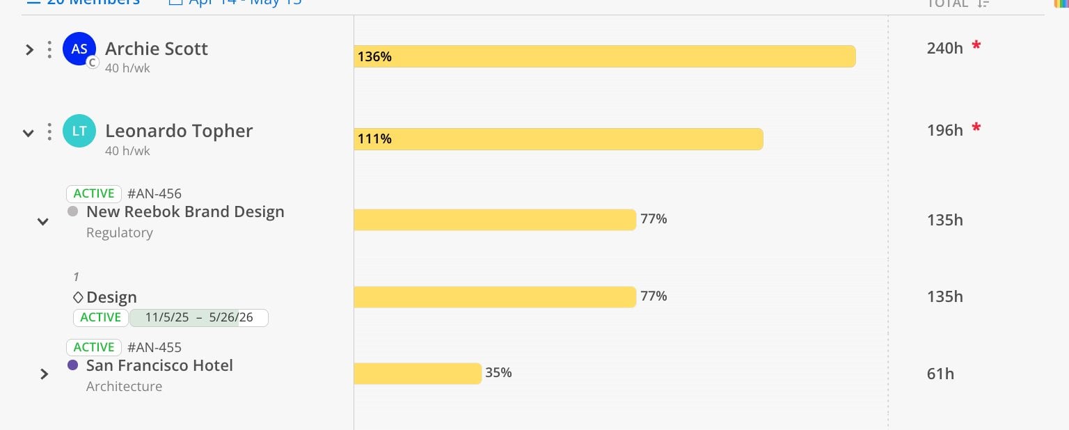
Color-coded project toggle — splits the bar into colored segments, one per project
Date range selector — This Week, Next Week, 30 Days, 3 Months, or Custom
Locate the small color toggle icon near the top of the report.
When enabled, each member's capacity bar splits into segments color-coded by project.
Quickly identify whether a member is concentrated on one project or spread across many.
Click the filter icon (horizontal lines) at the top of the report.
Add filters to narrow results by department, project type, role, etc.
Filters are the same as those used in the Workload and Planner spaces.
Note: Filters are not dynamic. If you add a member to a department or grouping, you must refilter to see the change.
Click the export icon at the top right of the report.
This report supports print.
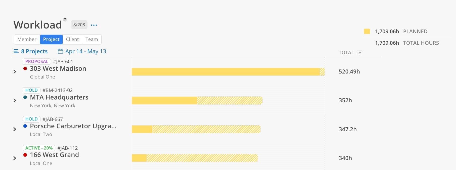
This report has 4 views: Member, Project, Client, Team (Chart). Each view shows the same underlying data organized from a different starting point.
The Member view is the default starting point. Each row represents a team member.
Click the Member tab at the top of the report.
Click the member selector and choose individual members, filter by department, or Select All.
Click Save.
Select a date range.
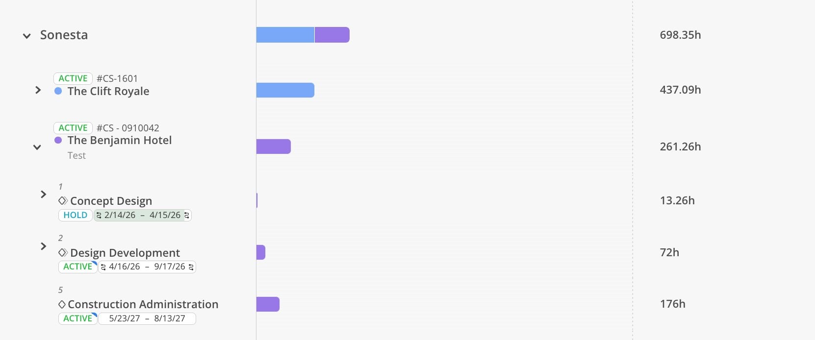
Each member shows their capacity bar. Click on a member's row to expand and see which projects and phases their planned time is allocated to. Members over capacity display a red asterisk (*) with the number of hours over.
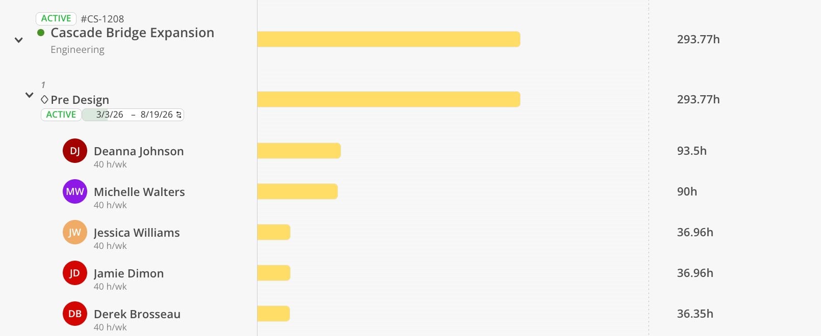
The Project view shows planned hours starting from the project level.
Click the Project tab at the top.
Select projects by name, number, portfolio, or use the starred portfolio shortcut.
Choose a date range.
Each project shows total planned hours. Expand a project to see which phases have planned time. Expand further to see individual member allocations within each phase.
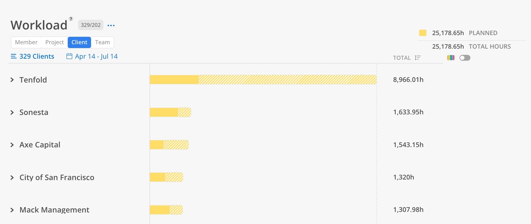
The Client view groups planned time by client.
Click the Client tab at the top.
Select your clients.
Choose a date range.
Each client row shows total planned hours across all their projects. Enable the color-coded toggle to see if a client's time is distributed across multiple projects or concentrated on one.
The Team view displays a chart summarizing planned hours vs. capacity over time.
Click the Team tab at the top.
Select members or teams.
Choose Quarter or Annual view (custom date ranges are not available in chart view).
This displays a bar or line graph. Toggle between bar and line graph formats. The chart is useful for seeing trends over longer periods — where capacity gaps or overages are developing.
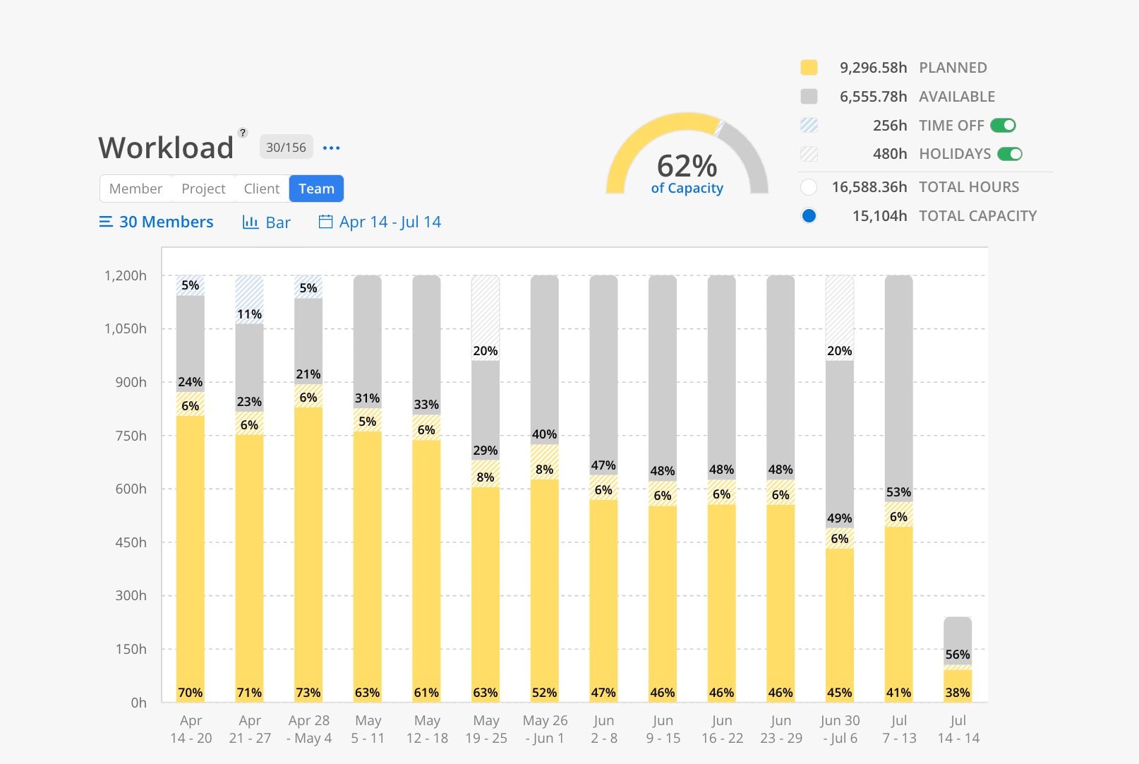
Note: The team view supports quarterly or annual time windows.